The Adjustment Layers in Photoshop are a group of a super useful, non-destructive image editing tools that add color and tonal adjustments to your image without permanently changing its pixels.
With the adjustment layers, you can edit and discard your adjustments or restore your original image at any time. This will make your workflow in Photoshop more flexible and efficient, and is an absolute must-know.
For this guide we’re going to go over the basics of each type of adjustment layer, working with their default settings in CS6.
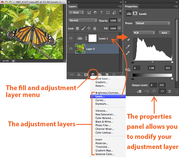
When you add an adjustment layer to your image, a new layer will appear over your image and a Properties panel specific to the type of adjustment you’ve selected will pop up. The Properties panel will allow you to modify your adjustment layer, which in turn will modify your image.
1. Brightness/Contrast
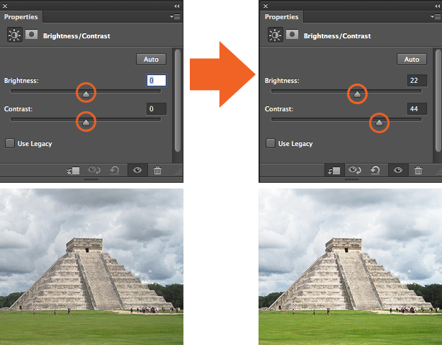
Brightness/Contrast makes adjustments to the tonal range of your image. The brightness slider is for adjusting the highlights in your image and the Contrast slider is for adjusting the shadows in your image.
2. Levels
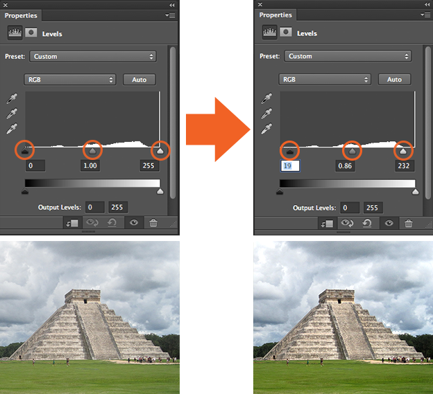
Levels modify the tonal values in an image by adjusting the levels of the shadows, midtones, and highlights. It’s one of the most used tools in the adjustment layer panel, and using just a touch of levels will go a long way in correcting your images.
3. Curves
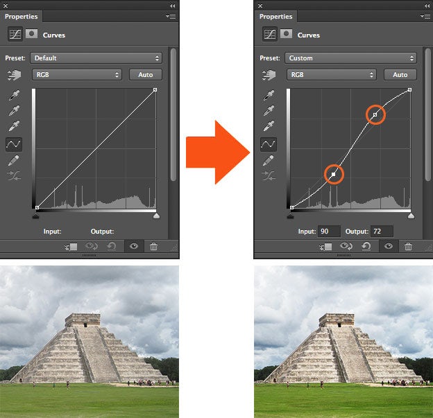
Curves let you adjust as many points as you want throughout the entire tonal range of your image, and is the most powerful and precise tool for editing the tones in an image. When you click on the curves adjustment, a diagonal line on a graph appears (left) which represents your image’s tonal range. The x-axis represents the original values in the image, while the y-axis represents the new adjusted values. Along each axis, you can see that there’s strip that’s a gradient from black to white, representing the tonal range of the image.
To increase the overall quality and contrast of your image, click to add points on the line of your graph. Once you’ve added a point, you can drag the point up or down with your mouse. Pulling the point down darkens your image, pulling the point up brightens it. What I’ve done above is add two points to my graph, pulling one up to enhance the highlights, and pulling one down to enhance the shadows in the image, creating a slight “S” curve. This is just the basics, but even the most simple uses of the curves tool can greatly improve your images.
4. Exposure
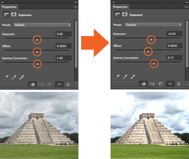
Exposure lets you adjust exposure levels with three sliders: Exposure, Offset and Gamma. Exposure will adjust only the highlights of the image, Offset adjusts the mid tones and Gamma will adjust the dark tones only.
5. Vibrance
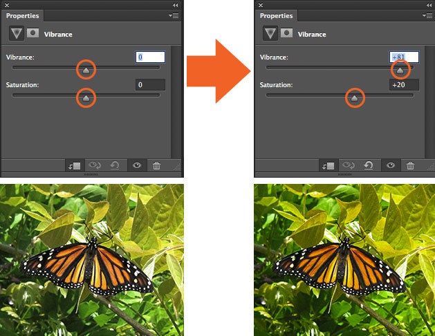
This adjustment layer modifies the vibrance of an image in two ways. The Saturation slider evenly increases the saturation of all the colors in the image. The Vibrance slider modifies the level of saturation of all the colors too but more selectively, focusing on the least saturated colors and avoiding over saturation of skin tones.
6. Hue/Saturation
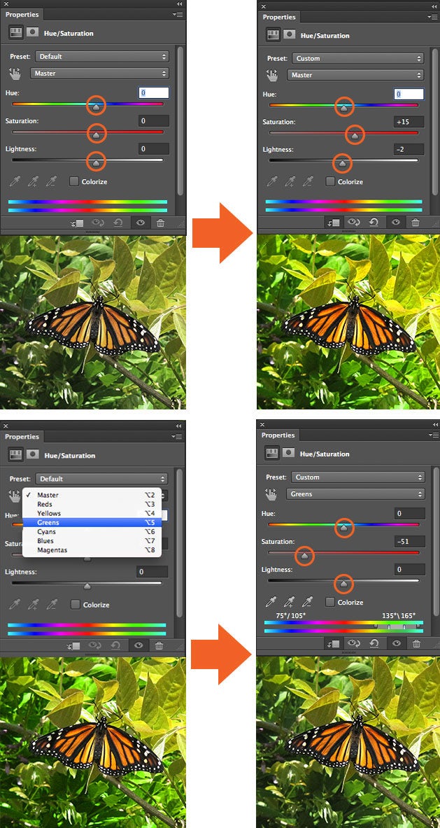
Hue/Saturation lets you adjust the hue, saturation, and lightness of your entire image or in a specific range of colors in your image.
In the first example, I adjusted the sliders to increase the saturation of the entire image. In the second example, I clicked on the “Preset” drop down menu, which gave me the option to select “Greens.” I selected the greens because I wanted to decrease the saturation of only the greens in my image to make it easier on the eyes.
It’s usually better to not affect saturation on an entire image — doing this reduces the overall tonal range. Instead try affecting the saturation of specific colors in your image to have greater control over your image editing. This tool is also good for colorizing grayscale images.
7. Color Balance
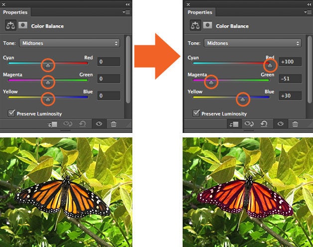
The Color Balance adjustment changes the mixture of colors in an image. In this example, I’ve made a selection of the butterfly’s wings only and adjusted the color balance sliders to bring out the reds and magentas in its wings.
8. Black & White
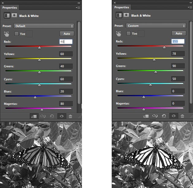
The Black and White adjustment lets you make grayscale versions of your images. The image on the left is the default setting. In the image on the right I changed the preset to “Custom” adjusting the sliders so that I have more control over how the reds in the wings of my butter fly were converted to black and white.
9. Photo Filter
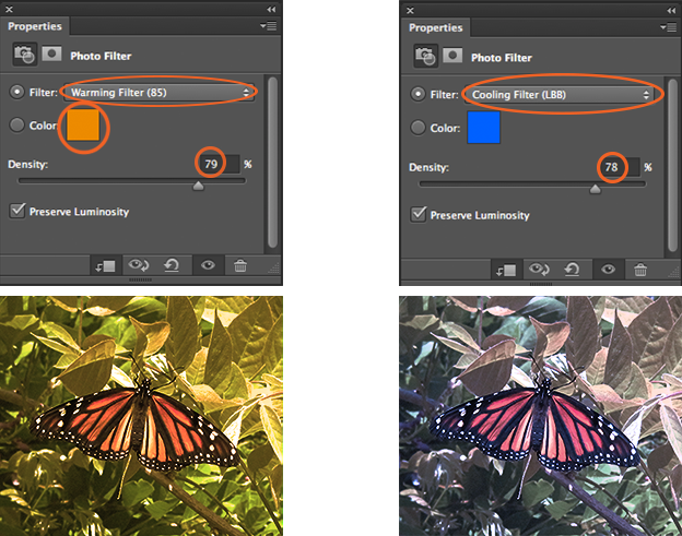
Photo Filter adds different color filters on top of your image. For both of the examples above the “Preserve Luminosity” box is checked by default and I adjusted the “Density” slider to intensify the effect of the filter. You can also customize each color filter by double-clicking the color swatch in the properties panel an adjusting it in the Color Picket window that pops up.
10. Channel Mixer
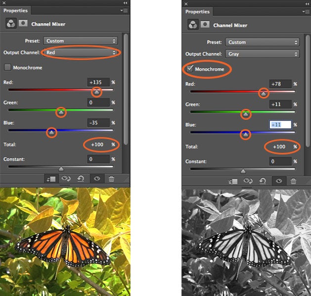
Channel Mixer modifies the colors in your image to create tinted or grayscale images. On the right we’ve used the red channel to bring out a red tint in the image. On the left we’ve checked the “Monochrome” box and adjusted the sliders to ensure a better color conversion to grayscale. For the best results with this tool, make sure that your channels add up to 100%.
11. Color Lookup
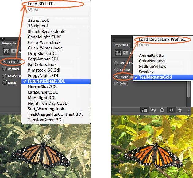
This adjustment comes with a bunch of pre-packaged “looks” for you to apply to your image. Three options (3DLUT File, Abstract, and Device Link) that are used to load these different looks. Each “look” remaps the colors in your image by using a lookup table (LUT). These effects are pretty interesting, and you can even create your own LUTs in Adobe Speedgrade and load into Photoshop to stylize your images.
12. Invert
The Invert adjustment layer makes a photo negative effect by inverting the colors of your image.
13. Posterize
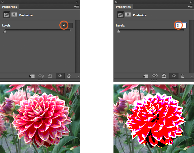
Posterize produces a flat, poster-like appearance to a photo by reducing the number of brightness values (levels) in the image.
14. Threshhold
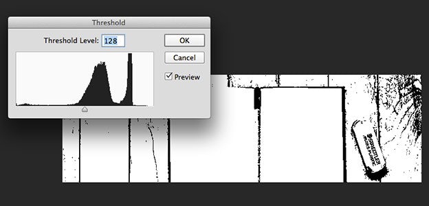
The Threshold tool turns your image into a black and white image. For this example I made of selection of only the flower so that the threshold was only applied to the flower. Increasing and decreasing the Threshhold level controls the number of pixels turning black or white.
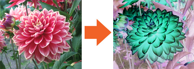
15. Gradient Map
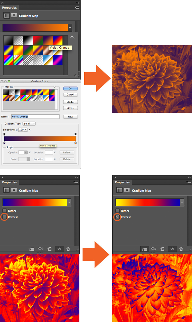
This tool converts the grayscale range of an image to a custom gradient fill. The Gradient Map tool comes with a bunch of different gradients, all of which you can adjust to your liking in the gradient editor window. Checking the “Reverse” box inverts the colors of your gradient.
16. Selective Color
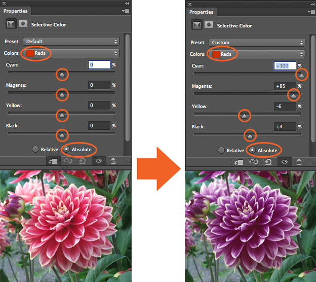
The Selective Color adjustment layer selectively modifies the amount of a primary color without modifying the other primary colors in your image. Since there’s a lot of reds in my flower photo, I’ve selected red from the “Color” drop down menu as the color in my photo that I want to select and change. By default the “Absolute” box is checked in CS6, which adjusts the color in absolute values. (The “Relative” option changes the existing amount of cyan, magenta, yellow, or black by its percentage of the total.)
Next, I’ve dragged the sliders around in the properties panel to increase and decrease the components in the reds in the image. As a result, I’ve selectively changed the reds in the photo without changing the greens in the photo. It’s a more precise tool for changing specific colors than Hue/Saturation and it’s often used for correcting skin tones in photos.
These examples are only a small taste of what each tool in the adjustment layers can do, they all have many more capabilities. But as basic or advanced as you get with it, using this non-destructive editing technique of adjustment layers will improve your workflow and make your whole Photoshop experience a lot easier.