
For the IREMOS IT Services logo, I focused on creating a clean, modern design that reflects the brand’s core values of security, innovation, and connectivity.
Research: I analyzed the IT industry to ensure the design communicated trust and stability.
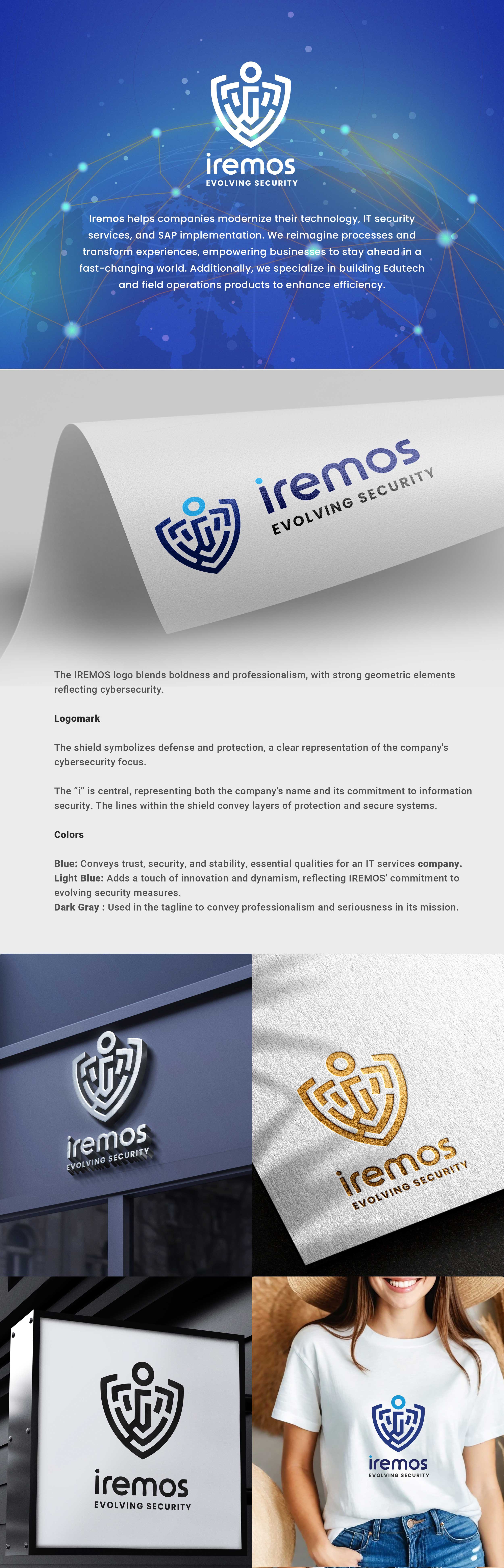
Concept Development: Geometric shapes like hexagons were used for their balance and structure, following the golden ratio for visual harmony.
"i" Integration: The "i" was placed centrally, symbolizing Iremos as the core of IT services and digital connectivity.
Result: The final logo is sleek and professional, with the geometric design and integrated "i" representing strength and security. The black-and-white color scheme ensures versatility and impact across all platforms.