
Created on 99designs by Vista
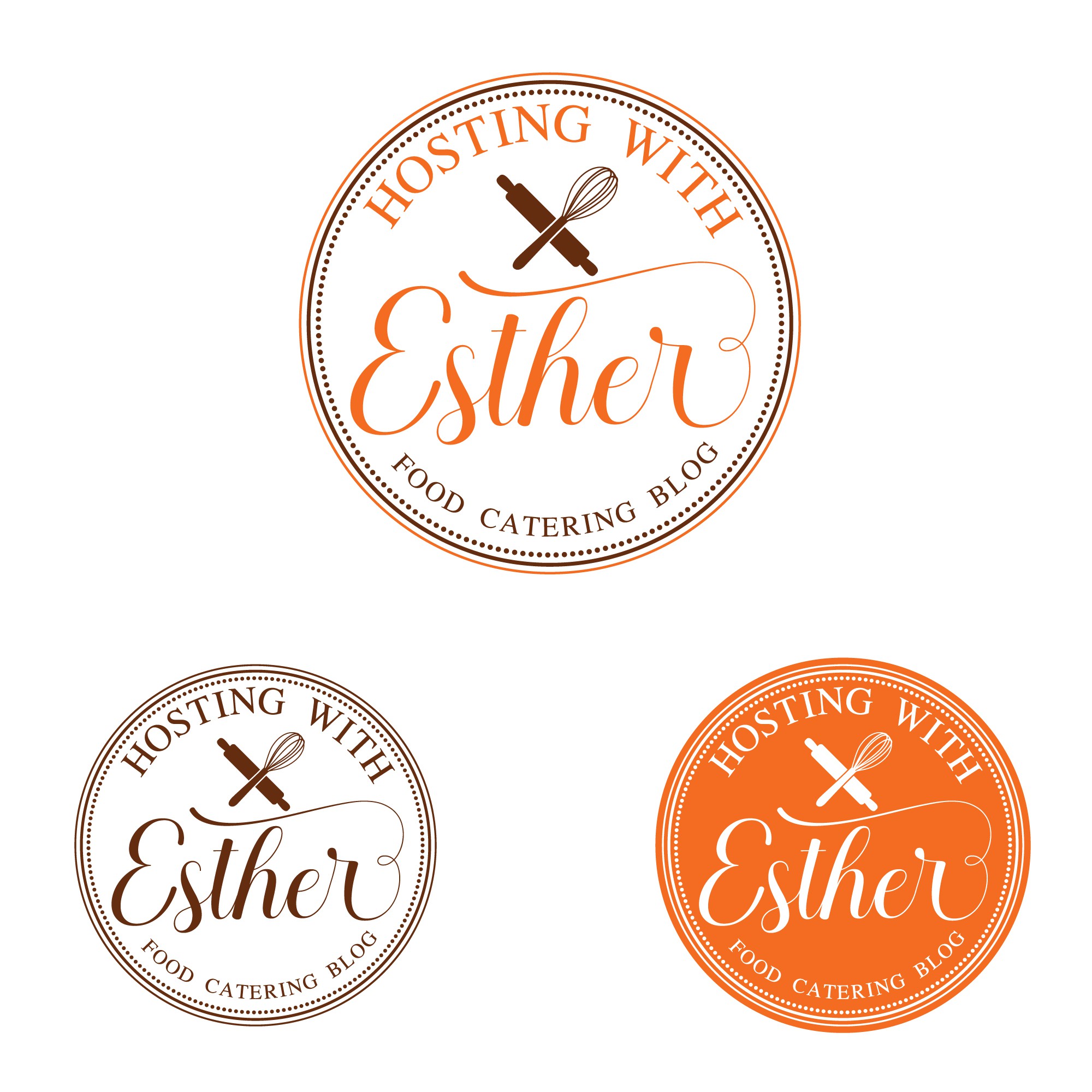
Designed as a classic and feminine logo for a food blog, this design incorporates a script font and simple silhouettes of kitchen utensils, aligning perfectly with the client's vision outlined in the brief. The color palette revolves around shades of burgundy and brown, enhancing its elegance and appeal. Crafted to be distinctly feminine and aesthetically captivating, the logo captures the essence of the food blog's style and audience, offering a timeless and inviting visual identity.