Bold logo concept for Construction company

0
Created on 99designs by Vista
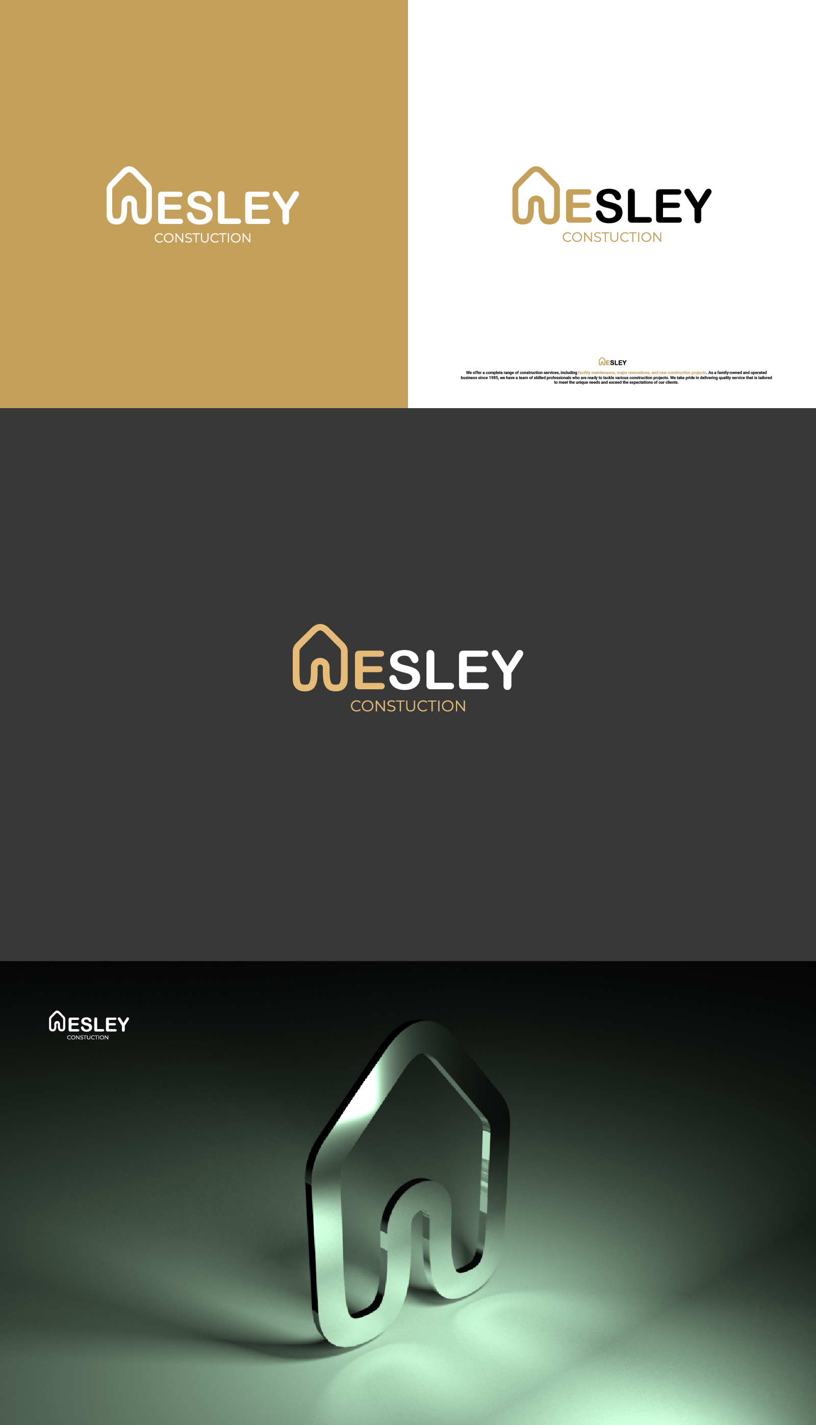
Design emerged from research into soft and subtle forms. The result is an abstract house, with its lower part forming the letter "W". The typography is chosen to complement the character of the logo. It's also possible to place the logo within a frame, with the wordmark either to the left or below (in that case we don't have to stick to this font).