Logo concept for Gorilla Sports

1
Created on 99designs by Vista
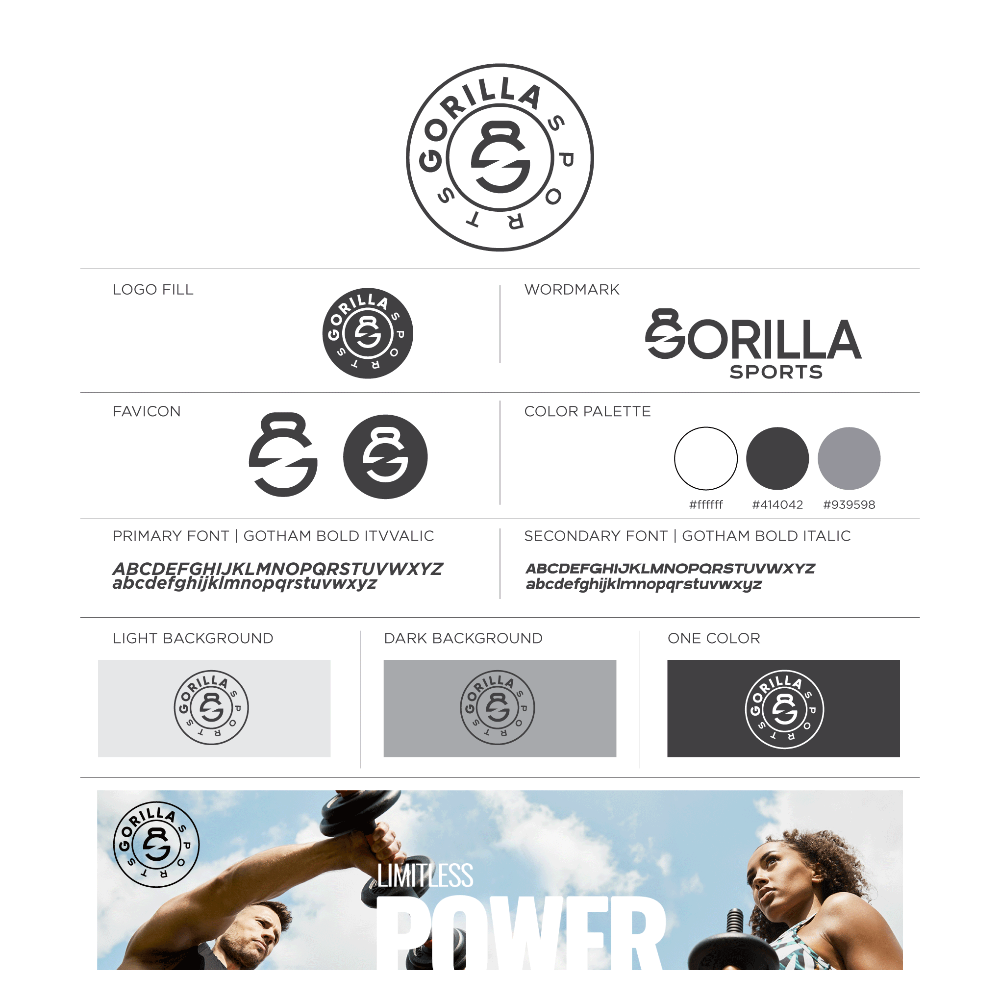
An eye behind the creative lens presents you a typographic gimmick Logo designs. it'll gives you a modern and premium look n feel with minimalistic approach. The gimmick between the “G” and the “S” is overlapping to each other’s into one letter and a handle on it is representing the “kettlebell”. The same approach is an idea how a fat becomes fit both are hidden in a person.
My main design interests include Concept, modern Typography, Color theme, artistic Compositions and fitness outlook.
Feel free to explore my creativity, I’ll be looking forward to working with you.
Thank you.