Branding for PARC Engineering

0
Created on 99designs by Vista
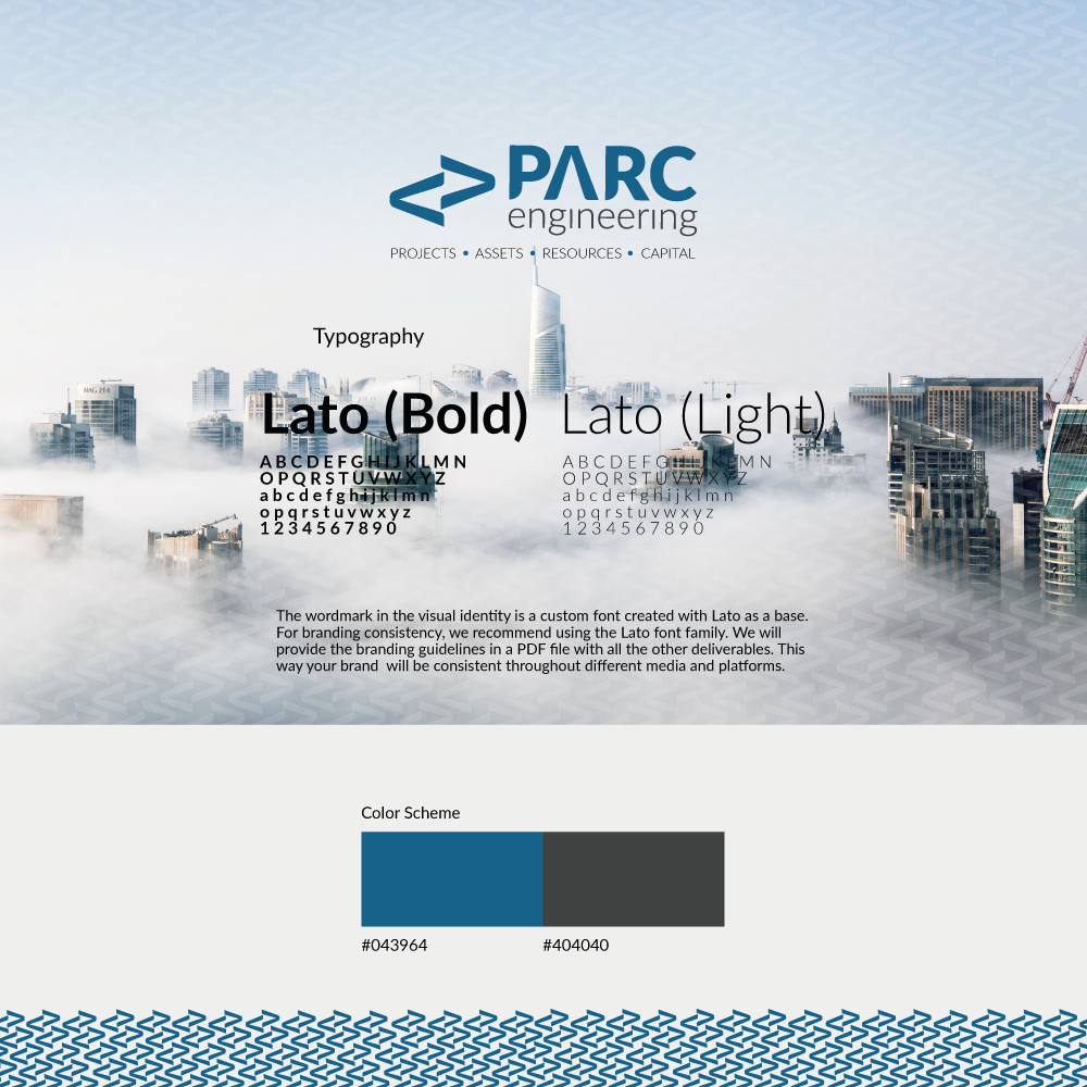
After researching PARC''s competitors and potential target audience, we decided that the best approach to designing their visual identity was to create a corporate look and feel represented in the typography used for the word mark, with the human touch visually represented through the use of a lowercase applied to the word "engineering". The icon is a combination of the arrow pointing up, used as the letter "A" in "PARC", with a bit of a twist that represents the ongoing movement.