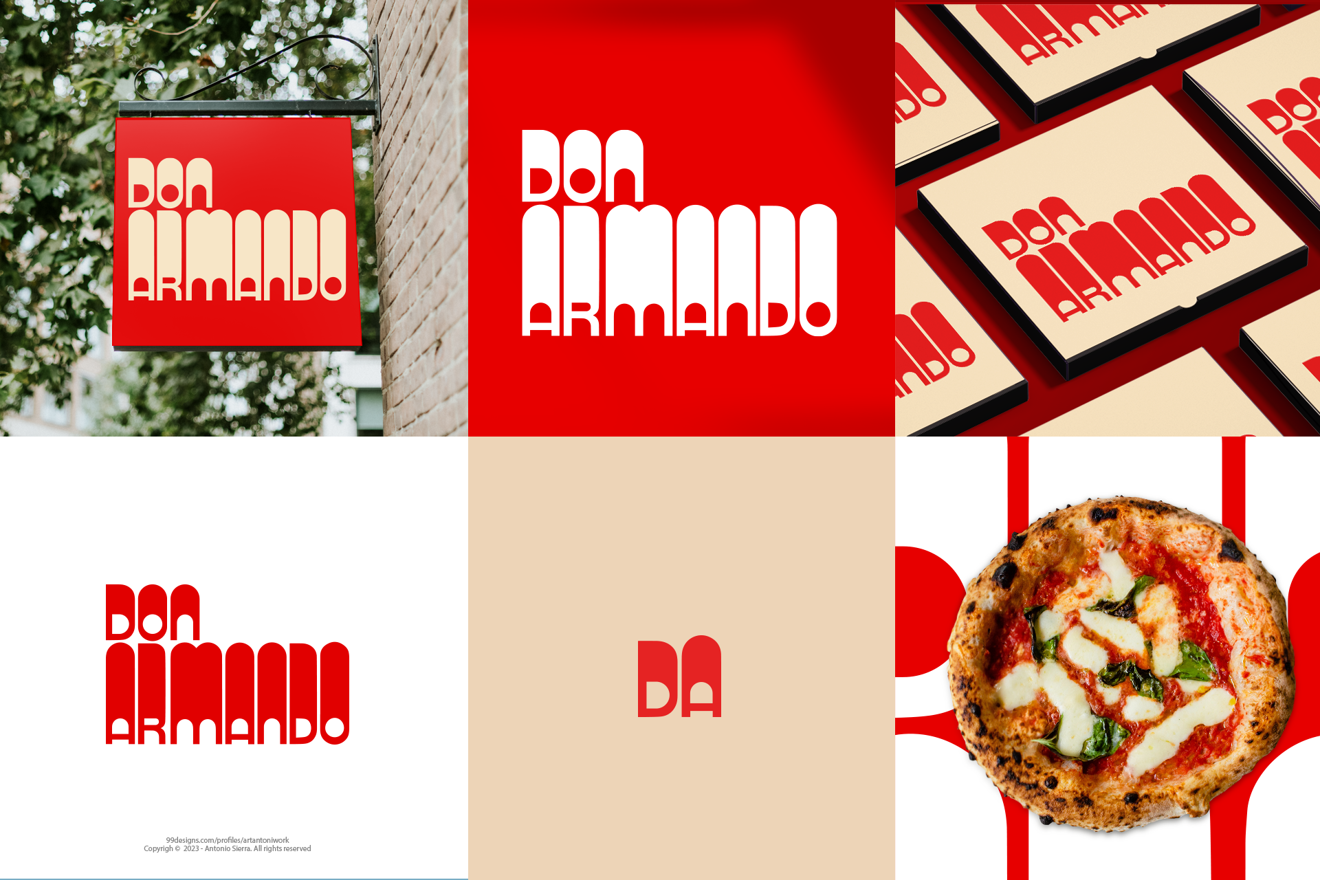
DON ARMANDO - ITALIAN FOOD LOGO

6
Created on 99designs by Vista
Evoking the nostalgia of 1960s aesthetics, drawing inspiration from the posters of that era and employing vintage typography. However, we aim to integrate a modern and artisanal touch. The typography is not merely an external element but a fundamental value. We strive to convey the sensation of the old adapted to the contemporary context. Family and Italian values are very present in my color palette; Hence, I pay tribute with their forms, imbuing them with the characteristic charm of Campari posters from that time