
I present to you my concept for the HUMANI HR visual identity.
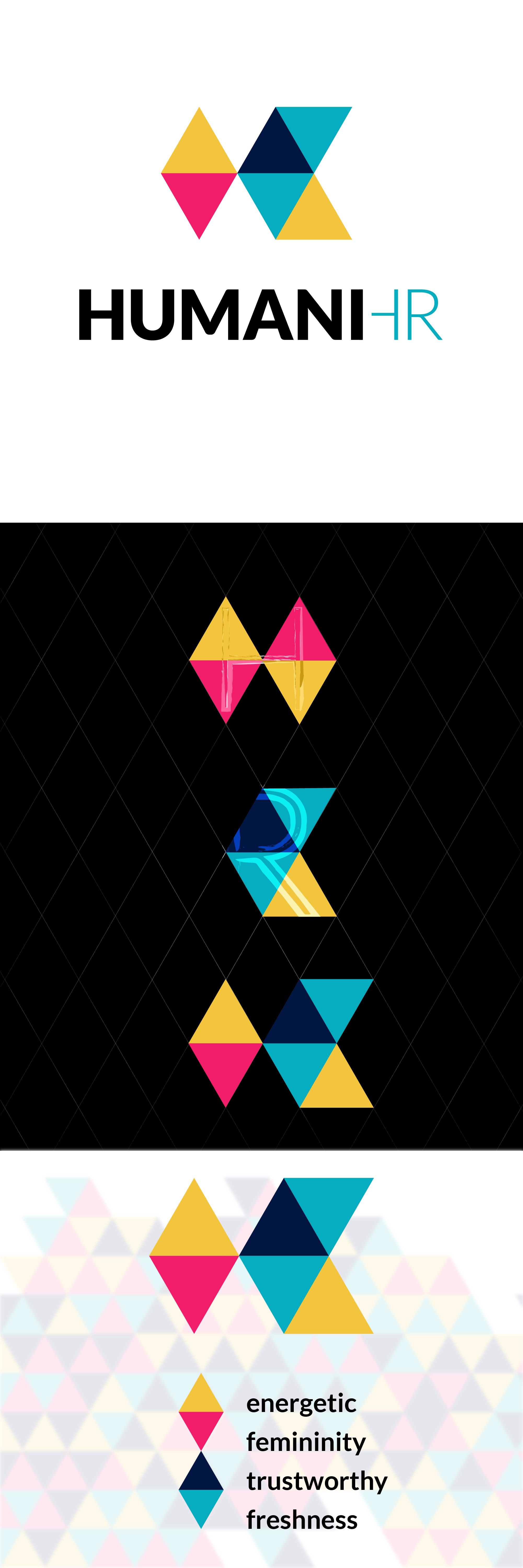
I chose a modern and abstract style for the symbol, based on triangles, to suggest stability, a quality that is looked for in a business partner, but also because they play a dynamic role, and for a HR business the dynamism is a critical part of the game.
The symbol is also an abstract representation of the “HR” and it’s a unique idea that will give a strong and prominent look for the HUMANI brand.
The color palette has two roles:
1. to show diversity, another important aspect the HR business is dealing with and
2. to set the tone for the visual identity, combining together a fresh, energetic, feminine and trustworthy look that can furthermore be used to define the company message and its brand voice.