
Created on 99designs by Vista
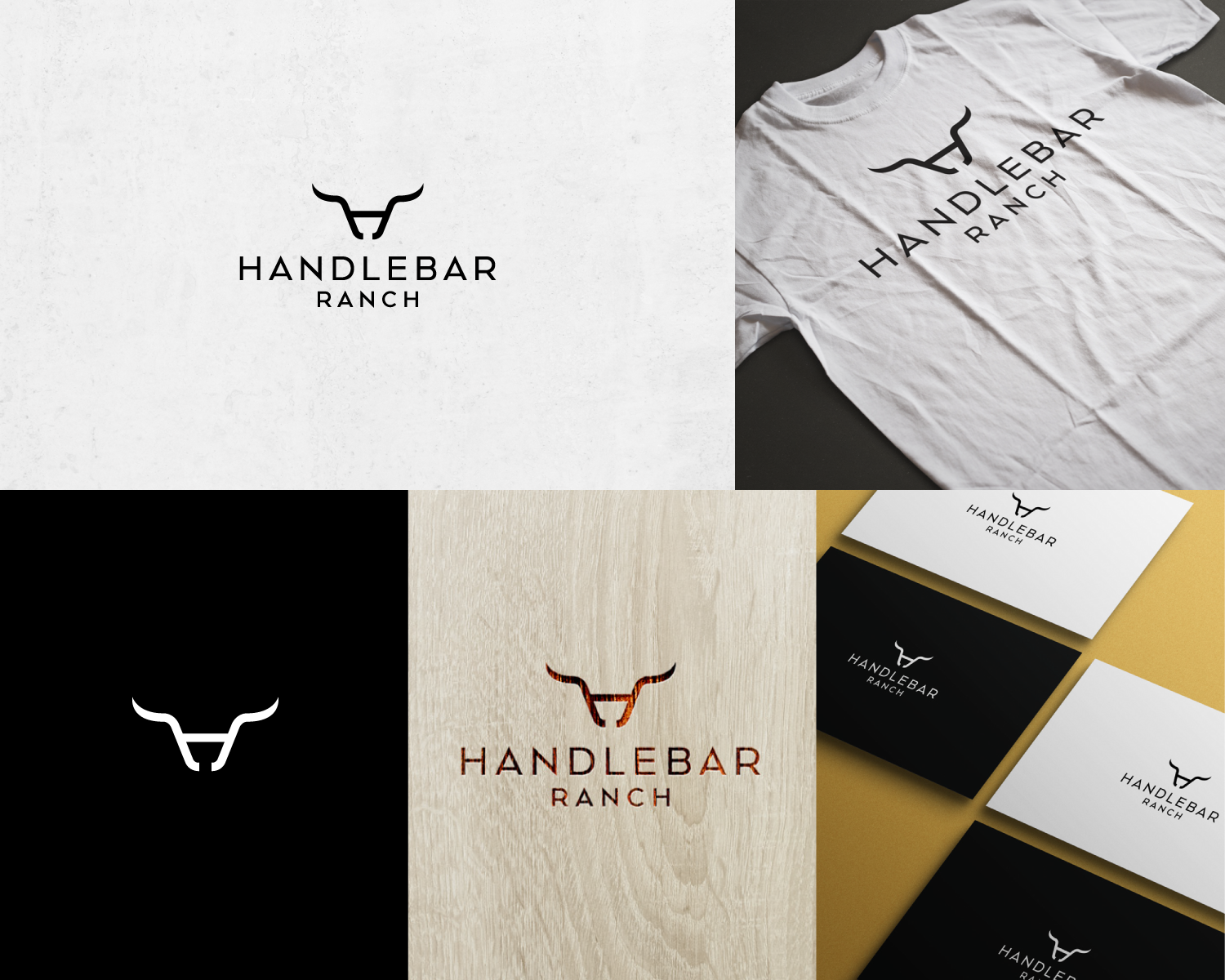
The great thing about this logo is that it is constructed with three graphic elements which are instantly visible.
Firstly we got the H letter, secondly because it is a ranch the horns and the simple cattle head shape had to be incorporated and lastly when looking at the whole logo icon you can clearly see a bicycle handlebar tying the whole concept of a airbnb ranch that is aimed for cyclists :)